
CityZen estate agent postcard flyers. Click to enlarge
This portfolio example was created back in 2013 to share with a local estate agents. After renting through them I had observed that their website lacked a clear identity inline with their offline visual materials – such as the postcard flyer pictured right.
Their existing design lacked strong user interface (UI) design and branding. Colours were not memorable – and reminded me of a Christmas tree than a young, dynamic estate agents. There was a lack of information hierarchy to guide the user to certain journeys through the site to achieve their goal and most importantly, the property pages didn’t wow. My conclusion was that the site was functional – but that it could create a greater conversion from casual viewer to enquiry, and subsequently to greater lets and sales.
I set myself a challenge to create high fidelity mockup concepts of what the site could look like if some basic UI design principles were applied. Drawing from their postcard, I defined a colour palette and visual identity.
Below are some examples of this redesign. Click any image to enlarge it
Homepage
| Before |
Proposed redesign |
Radical redesign |
  |
 |
 |
- This is the existing homepage
|
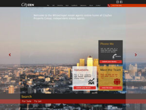
- This design features the bold black colour featured on the postcard, and introduces a primary red colour and accent gradients of the red. Use of light coloured columns and horizontal sections help divide information on the page, and clear header names help create information hierarchy so the reader can quickly scan the content
- Banner imagery is added to the top with a single banner indicating the area(s) covered. Imagery chosen should be modern, high definition and inspiring. A red overlay is applied to tint the photos according to the sites colour palette
- Overlaid on the banner images is a welcome message clearly calling out what the company is and where it is based. This was missing on the existing site – where the user has to integrate the site to identify the services offered
- Search and clear calls to actions (valuation and phone me) are added to the page to increase customer conversion
- The location of the agents is added to the portal homepage – providing a quick way to find them
- Key properties are added on a carousel banner below the fold. Key properties call out key information about each – including price, number of bedrooms and bathrooms
|
- The original redesign concept does not heavily deviate from the original design. This concept shows an alternative design which could be used to provide a more responsive, more modern landing page experience and drive users to explore properties. This page puts people front and centre and promotes key actions we want the viewer to take (such as getting a valuation or speaking to the team)
- It is proposed that the carousel banner would rotate the tiles on the homepage, and the next carousel tiles right would include featured properties
|
Property listing page
| Before |
Proposed redesign |
  |
 . .    |
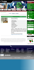
- Property listing details were basic
- Photos, which should be the real selling feature of a property, were buried in a secondary tab, and the thumbnail visible on first opening the property page was small
- Users in the western world read content (or more likely scan it) from left to right, top to bottom. Putting the tabs above property name and cost means many users may miss them, and when they do click them then the property details are hidden within the previous tab. This is a bad design
- A lack of information hierarchy meant the listing details did not stand out relative to the page header and right hand navigation
|
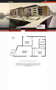
- In the proposed mockups property photos are front and centre with the aim of drawing you in to the rest of the listing. Key photos would rotate on a carousel banner with a mobile responsive design that works with mobile touch devices
- The property name and postcode is present on every page – drawing on the design of old London street signs – as featured on their postcard flyer
- A bold black line causes the For Sale / To Let label and price to stand out, with navigation tabs below echoing the sites overall navigation design
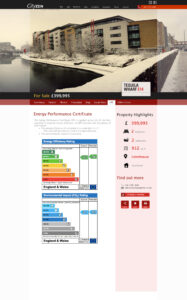
- A new property summary column appears on the right side of every listing – detailing key features of the property such as location, floor size, number of bedrooms and bathrooms. In the existing site these details do not stand out – making the property harder to read and more difficult to compare
- A map would be integrated into the property summary page to make this key information easily accessible
- Introduction of enquiry buttons and social media sharing icons make this listing easy to enquire about or promote to friends – both key actions in converting viewers to enquiries and then renters or buyers
- Two different colours would be used for sales and for listing. Sales would use the red accent colour, whilst listings would use the mustard yellow accent colour. This will help to quickly visually differentiate different functions of the site
|
Enhancing the property listing page
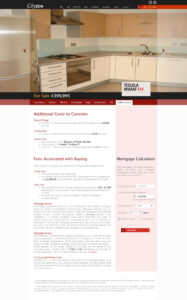 When performing competitive audit of other estate agent sites it was apparent that most, like this one, were not transparent about fees and overall costs to buy or rent. Sure all had headline numbers for weekly/monthly rent or sale price – but the unknown around hidden costs make for a scary experience for property seekers.
A simple way to address this is to be upfront with this information. I proposed that by integrating this info into property listing pages the agents could increase transparency, and therefore trust with their customers. By being upfront, they could help renters and new home owners plan – and in doing so differentiate themselves from the competitors.
New concepts – Community details
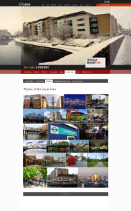
Exploring the website, there was no way to get a sense of what the area had to offer. The site focused on properties and details of the estate agents.
A new concept I introduced through my mockups was Local Area. The idea being that the estate agents could curate a set of locations for each of the areas – detailing what is in the area, commute distance, photos of the area, and link up to local events from other websites. Photos could be taken by their photographers – or could be crowdsourced through social media. The aim of this section was to sell the dream of what it would be like to live in the area. For renters and buyers not familiar with the area the aim is to show the colour and diversity – enlightening the reader about the numerous transportation options and local amenities.
From the estate agents perspective these pages could be created centrally and linked to in the listing backend to then display on property listings pages. Transport details could be drafted for the area, then overridden per property by copying the default and tweaking to the properties specific location.
The images to the right (click to enlarge) are two mockups of this concept.

 When performing competitive audit of other estate agent sites it was apparent that most, like this one, were not transparent about fees and overall costs to buy or rent. Sure all had headline numbers for weekly/monthly rent or sale price – but the unknown around hidden costs make for a scary experience for property seekers.



0 Comments