In Spring 2020 Faye Batley started a new community nursing role in the Frailty team of a local GP Practice. With COVID-19 lockdown restrictions limiting interaction with her service users (i.e. patients and users of her health services) she wanted to both:
- Introduce herself to her users
- Promote key information about the services she could offer her users
In doing so she wanted the information to be accessible, friendly and engaging without making the reader feel old, invalid or too proud to engage with her services.
Faye produced a one page pamphlet to meet the above goals and reached out to me for review as someone who doesn’t work in her profession.
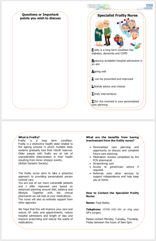
Original leaflet
The original leaflet provided all the key information Faye wanted to get across to her service users – but the use of two columns and fully justified text meant space was not optimally used and text was made harder to read than was necessary.
The benefits section was factual, but didn’t speak to the WIIFM factor – that is, the Whats In It For Me?
The use of orange content outlines and clipart were intended to put the reader at ease – making the information feel homely and relaxed but had the drawback of making the leaflet feel a little dated.
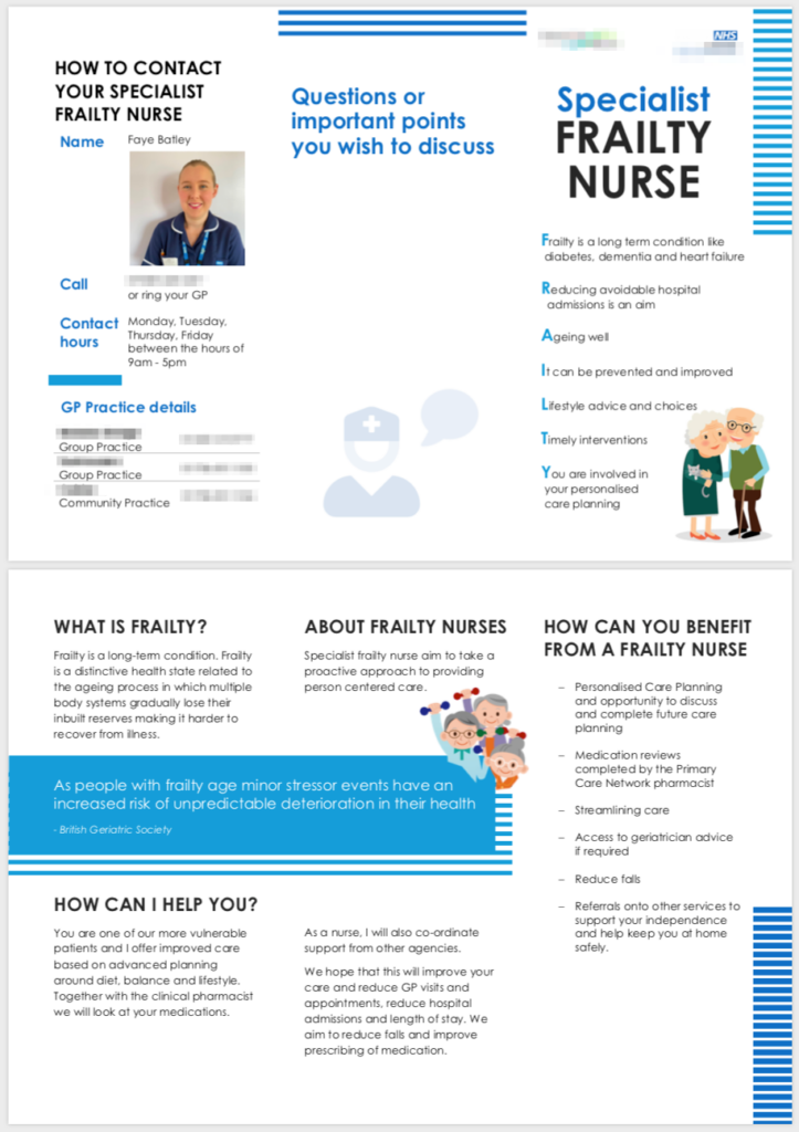
Reimagining the content
Information heirarchy
- To make the information more accessible I wanted to break it down into smaller sections that spoke to separate Who, What, Where, When, Why type of questions users may have
- Applying information hierarchy design I used font size, case, weight and colour consistently throughout to draw the eye quickly to the relevant information
Layout
- The first question I sought to understand was how users would read, transport and store the information. A 2 column, 1 fold layout would make the leaflet flatter for Faye to stack for distribution, but had more edges to fray and wouldn’t fit in small bags, jackets, compartments of cars or notice boards as easy
- A traditional 3 column, 2 fold layout would make the leaflet smaller and more convenient for users to transport whilst being more robust. This layout also lends itself to more flexible sections and easier grouping of co-related information
- A key requirement was to keep the FRAILTY definition on the cover, and to have a notes area on the back. Using the 3 fold design we were able to elevate the contact details to be visible on first opening of the leaflet – which helped address one of Faye’s primary goals and to put people at the centre of the conversation
Style guide – imagery, colour and tone of voice
- Having checked usage restrictions I was able to retain two of the graphics from Faye’s original design. Moving these to separate pages reduced visual noise and helped break up the text
- The use of an adapted font-awesome icon on the back page in light grey adds a watermark type graphic to break up the white space and helps imply what the page is for
- Consistent use of colour aligned to the NHS style guide helps make this look more authoritative
- Subtle tweaks to the language changes the tone to call out the WIFFM, and helps the user feel supported and loved
Feedback
I’m sure you’ll agree the redesigned pamphlet looks clean and modern as opposed to harking back to the 90’s. Faye did a fantastic job providing the content and ideas – she just needed a little guidance to elevate her key messages.
Through a/b user testing comparing the original and redesigned pamphlet we optimised the information presented and made it more person centric. An additional requirement came during review to provide details of the local GP Practice for the reader – ideally without having to print separate copies per practice. After a week of refinement the final design was agreed and went to print.
Faye is now sharing the pamphlet with her service users and the feedback has been glowing. Her users love that they can put a face to a voice, and when she has visited users they love that they can see the lady behind the COVID mask. Faye’s need to identify local GP’s is being met, and when she sits down with her users she can now circle or cross out the GPs she wants to draw attention to. She also finds the back page ideal for letting her users note down their questions when they remember so she can review this with them at the right time.
As an added bonus the design is now reusable, and her colleagues have expressed interest in using it in other practices, and adapting the content for other types of nursing.
Before and after


Above: Original pamphlet (on the left) vs redesigned pamphlet (right).
Note: for privacy I have obfuscated some information and logos in this post
0 Comments